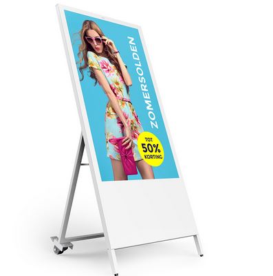
Even when digital marketing has transformed the way businesses engage in brand promotion, local outdoor advertising continues to play a vital role for small businesses, especially in the retail sector. One of the most popular devices for outdoor advertising is the humble sandwich sign that has all the advantages of being affordable, portable, easy to set up and take down, durable, and customizable. These compact signs placed just next to your shop’s entrance serve to attract the attention of passersby and encourage them to step in and buy. Some tips for designing high-impact sandwich signs:
Choose the Right Type of Sign
Typically, you can get these portable signs in a two-sided and one-sided version. Your choice will depend on how you will be able to place it on the sidewalk. If space is enough, you can buy a double-sided sign that can be placed at right angles to your shop, allowing pedestrians from both directions to see it well. On the other hand, if the sidewalk is not wide enough, you should go in for a one-sided sign that can be set up flat against your shop’s wall.
Work with the Right Color Palette
Sidewalks are busy places, and passersby are likely to miss seeing your shop sign if they are focused on reaching their destinations or engrossed in conversation with someone. Having brightly colored A frame signs can help to draw their attention. For best synergy, try to stick with your brand colors – it will help you build a better brand association. If you don’t have a specific brand color, go with trendy and bright colors that are hard to miss.
Ensure Your Sign Is Legible and Readable
Regardless of the trouble you have taken to develop an attractive design for your sidewalk sign, it will not serve its purpose if it is not legible. It is the reason why you must pick typefaces that are easy to read even from a distance. Also, choose a font size that people will not have to strain their eyes to read. However, keep in mind that even too big a font size is not recommended as it overwhelms the senses. Keeping the sign clutter-free and writing in text in a color with the maximum contrast with the background helps make it readable. The main purpose of contrast is to grab customer attention, says a Sitepoint report.
Do Not Miss Out the Logo and the Business Name
Since the purpose of the sandwich sign is to encourage footfalls, you must ensure that it includes your logo and business name, even if it is just outside your store. It will boost the brand association and help to build top-of-the-mind recall. It will also help to prevent confusion with people if there are several sandwich signs of other businesses in the same place.
Conclusion
You can get the maximum ROI from your sidewalk signs, by ensuring your message is crisp and brief and provides a compelling reason for people to step in. Ensure that your design is attractive enough to catch the eyes of potential customers, however, ensure that it does not interfere with the clarity of the communication.
